Mobile-friendly email signatures: Ensuring readability across all devices – 7 tips

Table of Contents
Mastering Mobile-Friendly Email Signatures: A Guide to Cross-Device Readability
In today’s mobile-first world, ensuring your email signature looks great on every device isn’t just a nice-to-have—it’s essential. As a digital communications specialist who’s optimized countless email campaigns, I’ve seen firsthand how a poorly rendered signature can undermine an otherwise professional message. Let’s dive into the art and science of creating mobile-friendly email signatures that maintain their impact across all devices.
The Mobile Imperative
Consider these statistics:
- Over 60% of email opens occur on mobile devices
- 75% of Gmail’s 1.5 billion users access their accounts via mobile devices
With numbers like these, optimizing for mobile isn’t optional—it’s critical.
Key Principles of Mobile-Friendly Signatures
- Simplicity is Key
Keep your signature concise and to the point. On smaller screens, less is definitely more. - Responsive Design
Ensure your signature adapts to different screen sizes without breaking or becoming unreadable. - Touch-Friendly Elements
Make links and buttons easy to tap with a finger, not just click with a mouse. - Fast Loading
Optimize any images or graphics to ensure quick loading times, even on slower mobile connections.
Practical Tips for Mobile-Friendly Signatures
1. Limit Information
Stick to the essentials:
- Name
- Title
- Company
- One or two contact methods
- A single call-to-action (CTA)
2. Use a Single-Column Layout
Vertical layouts are easier to read and less likely to break on mobile devices.
3. Optimize Font Choices
- Use web-safe fonts that render well across devices
- Stick to 2-3 font sizes maximum
- Ensure your smallest font is at least 11px for readability
4. Be Cautious with Images
- If using images, keep them small (under 10KB)
- Use ALT text for images in case they don’t load
- Consider using CSS for social icons instead of images
5. Make Links Tap-Friendly
- Ensure clickable elements are at least 44×44 pixels
- Space out links to prevent accidental taps
6. Use Responsive Design Techniques
Implement media queries to adjust your signature based on screen size:
css@media screen and (max-width: 480px) {
  .email-signature {
    width: 100% !important;
    font-size: 14px !important;
  }
}
7. Test Thoroughly
Test your signature across:
- Multiple devices (phones, tablets, desktops)
- Various email clients (Gmail, Outlook, Apple Mail, etc.)
- Different operating systems (iOS, Android, Windows, macOS)
Real-World Example
Let’s look at a before-and-after example of a signature optimized for mobile:
Before (Desktop-Oriented):
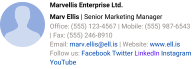
After (Mobile-Friendly):

The mobile-friendly version:
- Uses a vertical layout
- Reduces information to essentials
- Uses icons to save space
- Is easier to read and interact with on a small screen
Measuring Success
To ensure your mobile-friendly signature is effective:
- Track Click-Through Rates: Compare mobile vs. desktop engagement with signature links.
- Gather User Feedback: Ask colleagues and clients about their experience with your signature on various devices.
- Monitor Load Times: Ensure your signature doesn’t significantly increase email load times on mobile.
- Check Rendering: Regularly view your signature on different devices to catch any display issues.
Challenges and Solutions
- Challenge: Maintaining brand consistency across devices.
Solution: Create a simplified version of your brand elements that works well at smaller sizes. - Challenge: Balancing information and readability.
Solution: Use progressive disclosure—include essential info in the main signature and link to more details. - Challenge: Dealing with various email clients’ quirks.
Solution: Use HTML tables for layout stability and inline CSS for consistent styling.
Conclusion
In our mobile-centric world, ensuring your email signature is readable and functional across all devices is crucial. A well-designed, mobile-friendly signature enhances your professional image and improves communication effectiveness.
Remember, the goal is to create a signature that looks great and functions well, whether it’s viewed on a 5-inch smartphone screen or a 27-inch desktop monitor. By following these guidelines and regularly testing your signature, you can ensure that your final impression in every email is as strong as your first, regardless of how it’s viewed.
Embrace the mobile-first mindset in all aspects of your digital communication, including your email signature. In doing so, you’ll not only improve the user experience for your recipients but also demonstrate your company’s adaptability and attention to detail in our ever-evolving digital landscape.